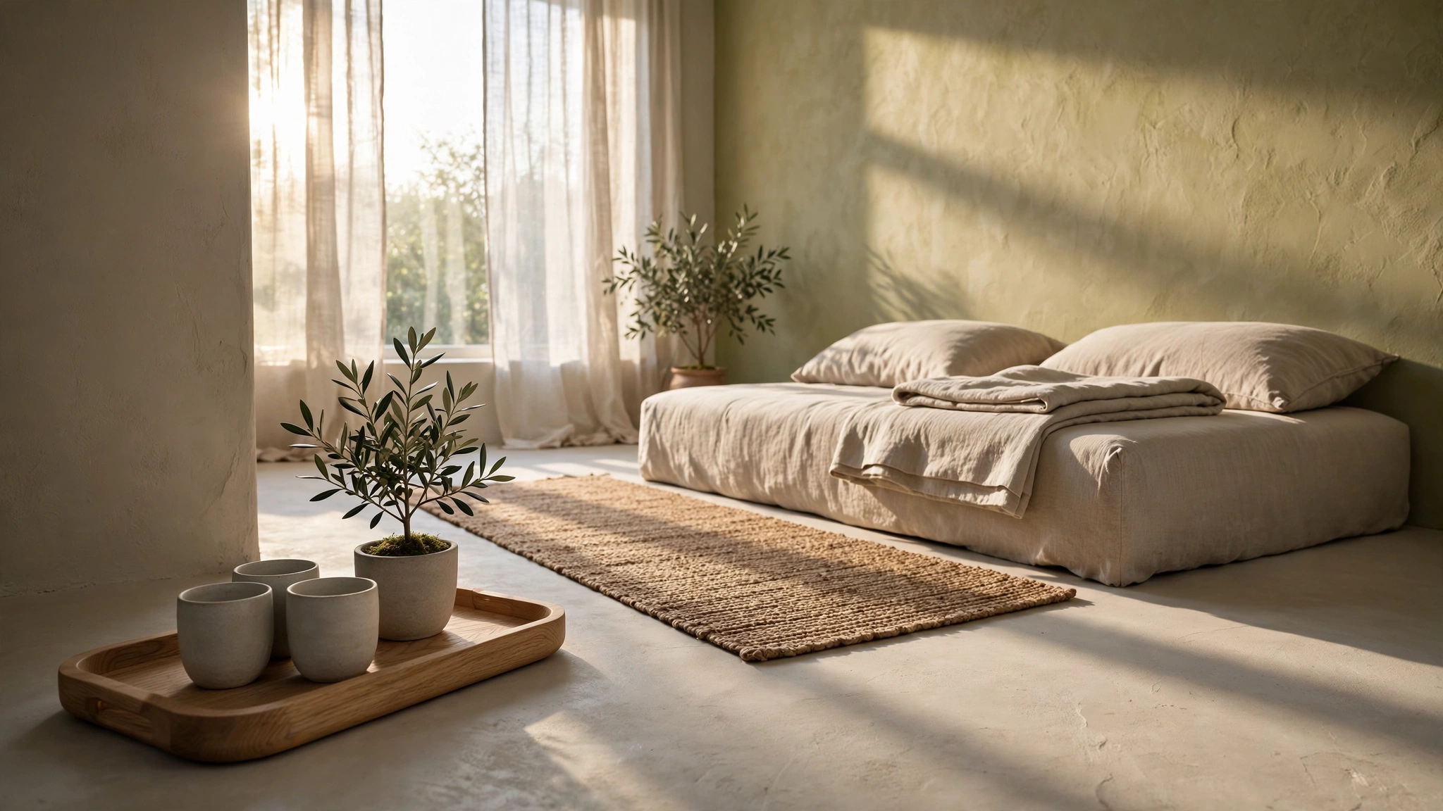
A beige room should feel like late afternoon. Too often it feels like a waiting room at noon. The furniture is soft, the palette is warm on paper, and still the space reads cold. This field log, recorded in a compact Japandi apartment, argues that the cold is not a colour failure. It is a texture failure. When wall, sofa, rug and curtain all present the same smooth finish, light bounces evenly, shadows disappear, and the eye finds no gradient to rest on. Warmth, in a real room, is contrast you can feel.
Arrival — the first three seconds
The log opens at the threshold, where the home makes its first promise. From the doorway the beige interior looks tidy and bright, yet strangely flat. A low linen daybed sits against a limewash wall, a woven runner crosses pale flooring, and morning light enters through sheer curtains. Nothing clashes. Nothing holds. That first impression matters because the nervous system reads a room the way it reads a face: in gradients. A room warms through tiny changes of plane, fibre and shadow. A single flat beige, repeated without relief, gives the brain a photograph instead of a place.
The correction begins before any object is added. Raking light is allowed to do the work a new paint colour usually promises. When low sun crosses hand-troweled limewash, each trowel mark throws a shadow thinner than a fingernail. The wall stops being background and becomes weather. You can almost hear the room slow down, because the gaze finally has a rhythm to follow rather than a blank to scan.
Negative Space — why emptiness needs an edge
At 02:15 the log turns to negative space, the quiet intervals between objects. In a cold beige home, emptiness is usually just leftover floor. In the Japandi interior shown here, emptiness is framed. The daybed is low and plain, but it is set against texture; the runner is simple, but its woven edge draws a clear path; a small olive plant beside the window gives the blank wall a living counterpoint. Negative space warms a room when it has a textured border. Without that border, minimalism reads as absence. With it, minimalism reads as rest.
This is also why adding more beige objects rarely helps. A beige cushion on a beige sofa in front of a beige wall deepens the flatness it was meant to cure. The log instead varies the finish while keeping the palette still: matte clay plaster beside crumpled linen, smooth stoneware beside rough jute, pale oak grain beside a soft woven throw. The colours stay close. The surfaces disagree gently. That gentle disagreement is perceived, physiologically, as warmth.
Tactile Details — warmth you can touch at a distance
The tactile sequence at 04:30 moves closer. An oak tray holds three stoneware cups, their glaze slightly uneven. Linen folds catch light along each crease. The runner shows every twisted fibre. None of these details is decorative in the usual sense. Each one breaks a large, cold field into small, readable events. In a home it simply feels like the difference between a showroom and a room someone inhabits with care.
There is an acoustic twin to this effect. Hard, smooth surfaces return sound sharply, which the ear registers as cool and exposed. Fibrous, uneven surfaces scatter that return. Footsteps soften on jute. A cup set down on oak sounds lower than the same cup on glass. The room in the log is not treated with panels or technology; it is tuned by choosing materials that absorb a little light and a little sound at the same time.
For a renter, the sequence is deliberately reversible. One textured panel or limewash wall behind the seat used most. One woven runner where bare floor currently stretches unbroken. One tray that gathers small ceramics into a single tactile group instead of scattering them across a shelf. Keep the beige. Change how the beige behaves under light and under hand.
Evening Stillness — the test after dark
The final chapter, at 06:45, returns to the same corner in the evening. This is where flat beige usually fails completely, because even daylight no longer models the surfaces. In the logged room, a single warm source near the daybed restores the gradient the sun provided in the morning. Shadows pool along the limewash, linen folds deepen, oak darkens at the edge of the light. The palette has not changed since noon. The feeling has, because contrast has.
The lesson of the log is therefore practical rather than stylistic. If a beige home feels cold, do not reach first for a warmer beige. Reach for a rougher wall, a woven path, an unsealed timber surface, a curtain that turns hard light into a soft field. Warmth is not a hue to buy. It is a relationship between light, material and touch — and texture is where that relationship becomes visible.
For the entryway version of the same principle, see our field log on the 1cm threshold step and the companion Genkan Design Guide, where a pebble tray, a low bench and one woven mat reset the day at the door.
Four tactile pieces used in this log
One wall behind the daybed is enough. Broad, overlapping strokes give daylight a rhythm and turn flat beige into a warm, shadowed field.
Laid across pale flooring, the weave warms the path by footfeel and gives negative space a clear, tactile edge.
Gathers stoneware cups and a small plant into one warm group on the floor or low table, instead of scattering beige on beige.
Folded over the daybed, crumpled linen restores the soft gradient flat upholstery removes, in light, sound and touch at once.
Affiliate Disclosure: As an Amazon Associate, Komorebi Threshold earns from qualifying purchases.
Continue the study with us
Each week the lab publishes one field log — a measured room, a corrected mistake, a calmer threshold. Join the discussion on Facebook, and watch the full field investigations on YouTube.
Interior imagery in the video is AI-illustrated and labelled as such on YouTube.